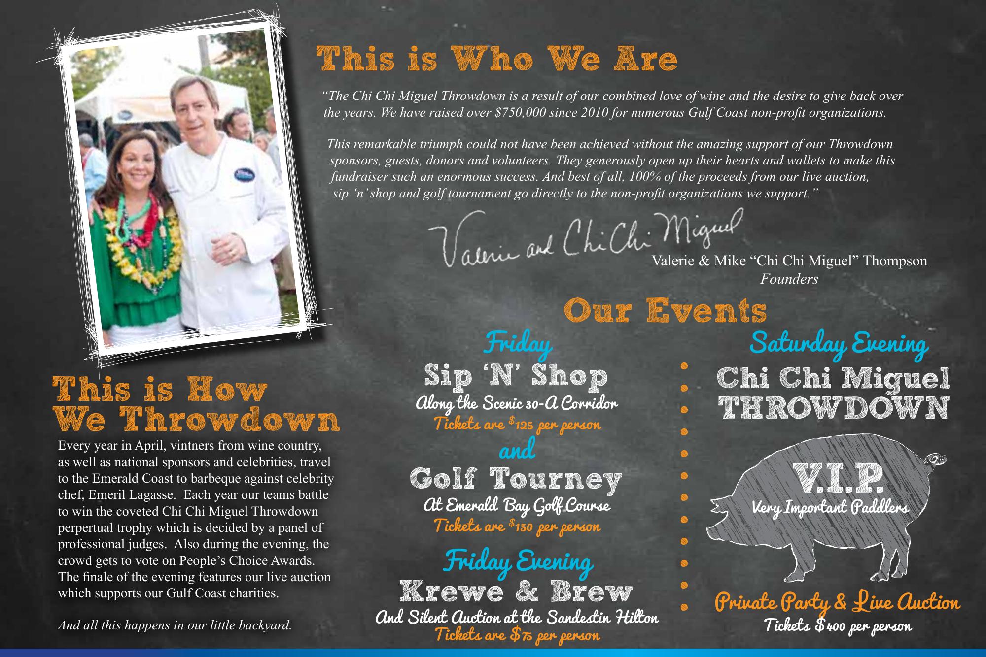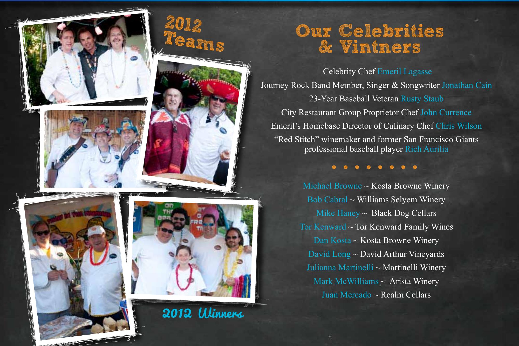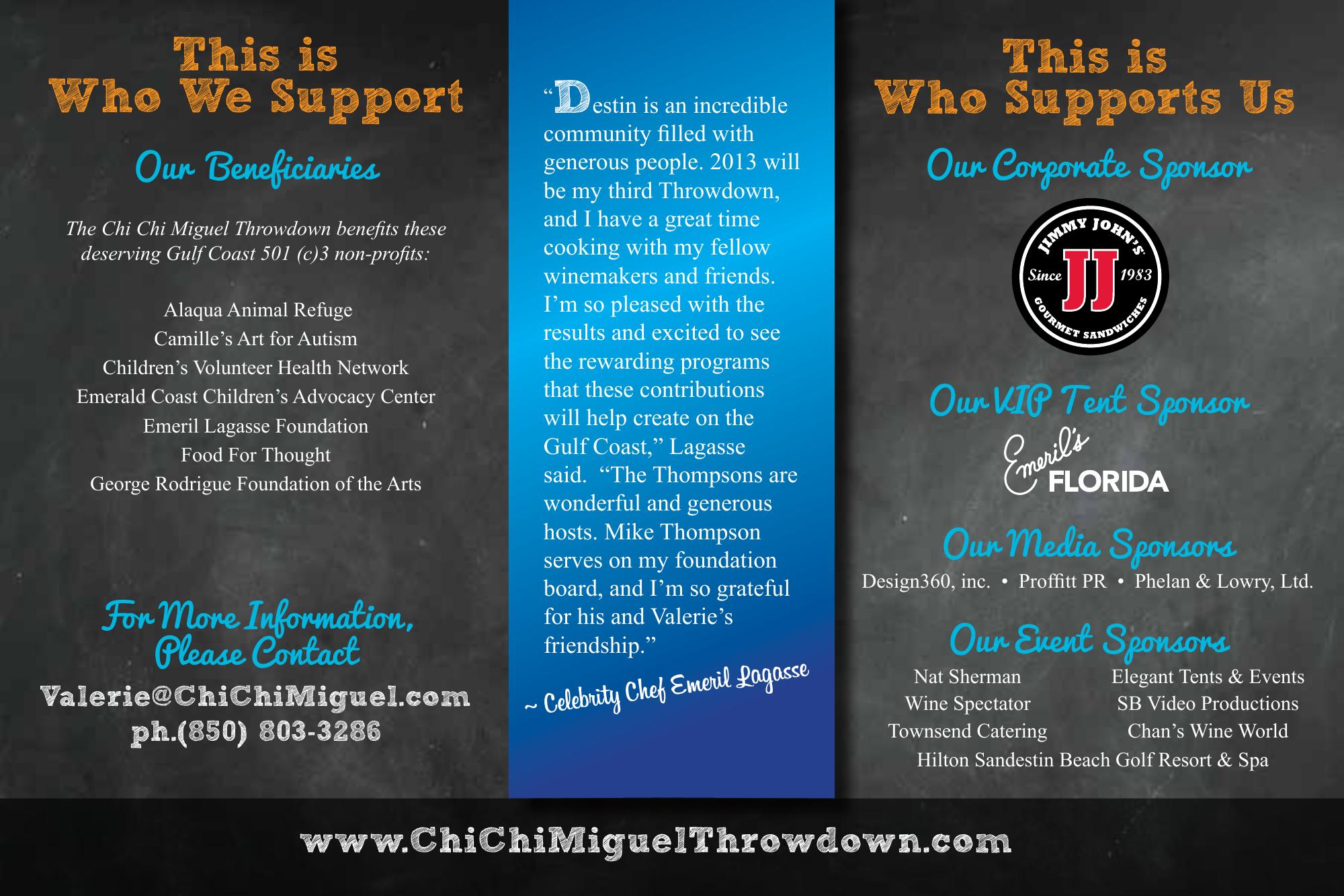
Building the visual language of a philanthropic tradition.
The challenge
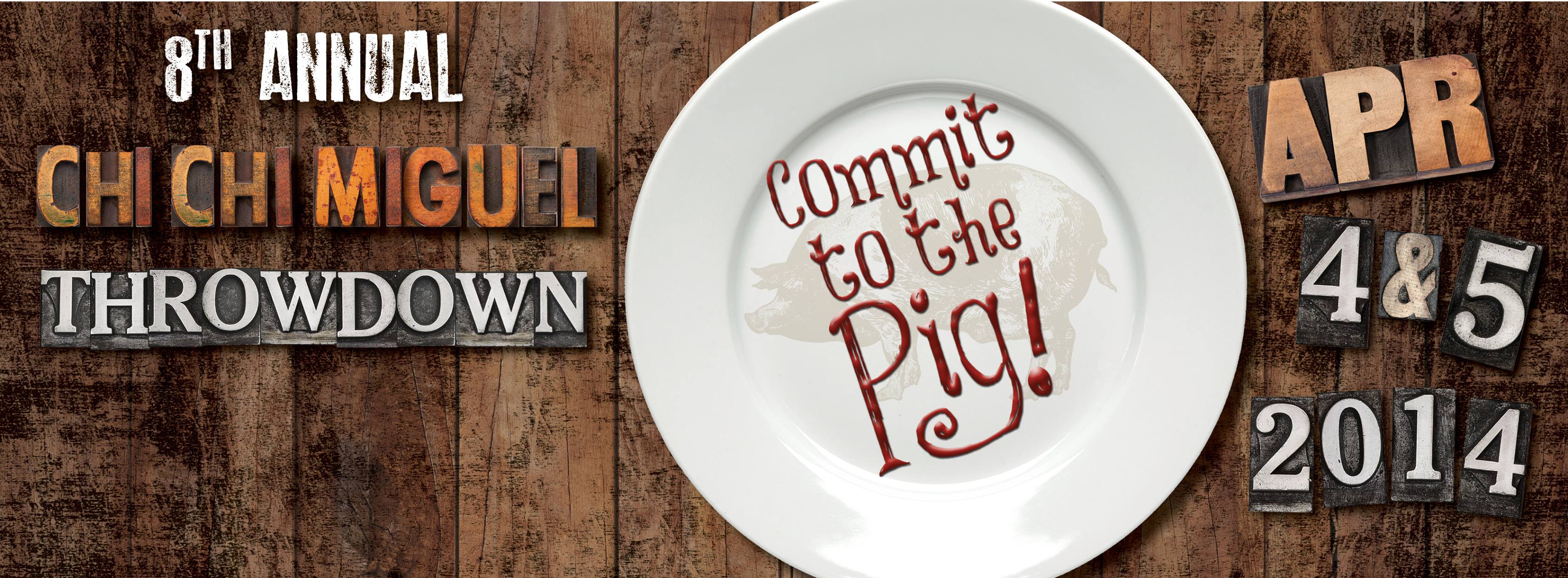
Each year needed to feel new, memorable and worthy of a major fundraising weekend while remaining connected to the warmth, humor and generosity that defined the original Chi Chi Miguel Throwdown.
The approach
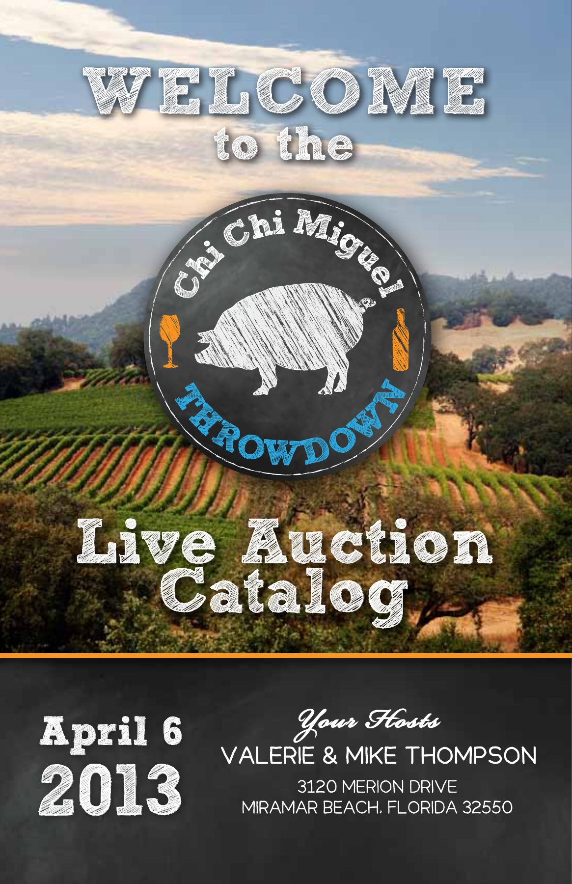
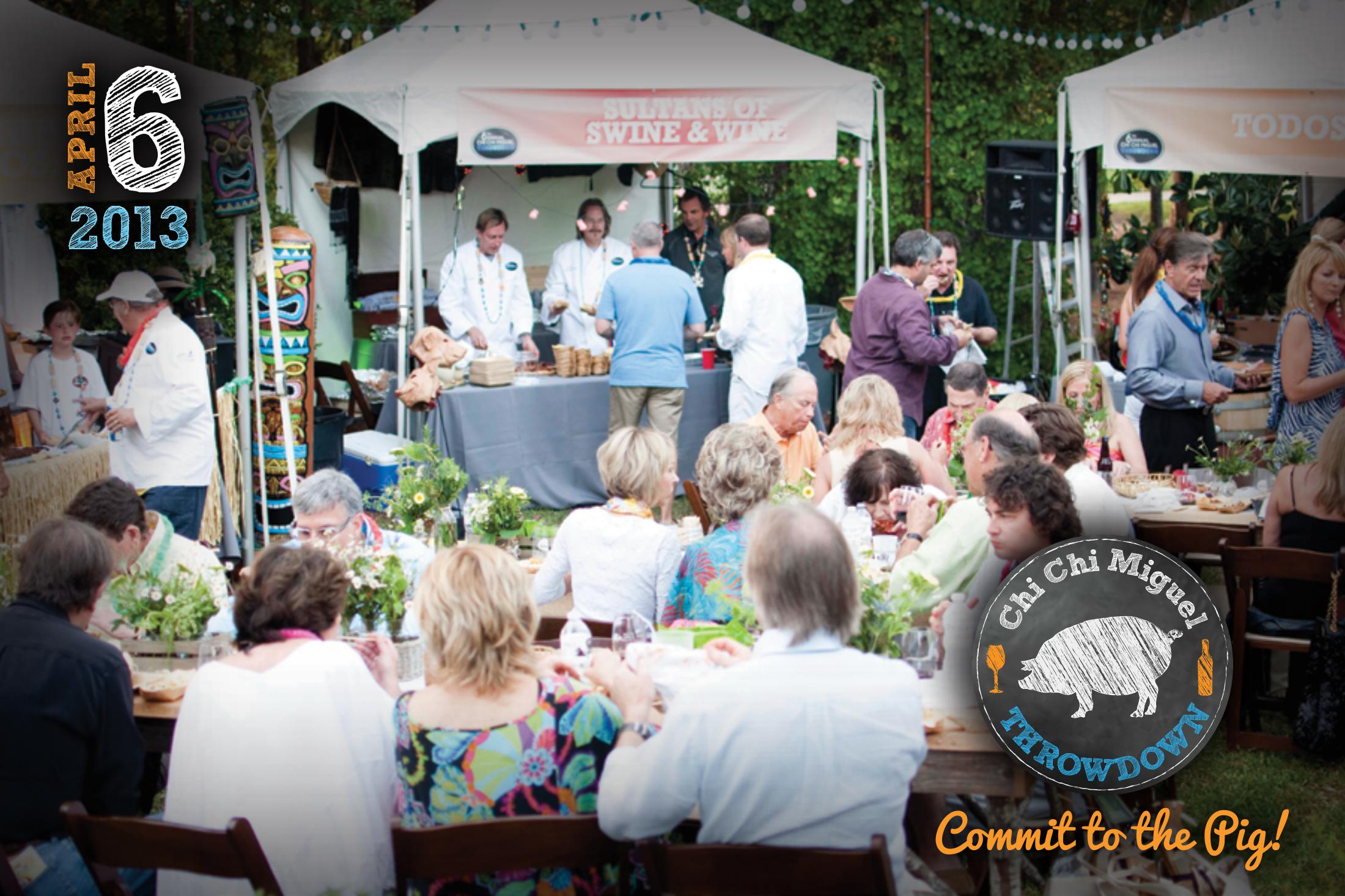
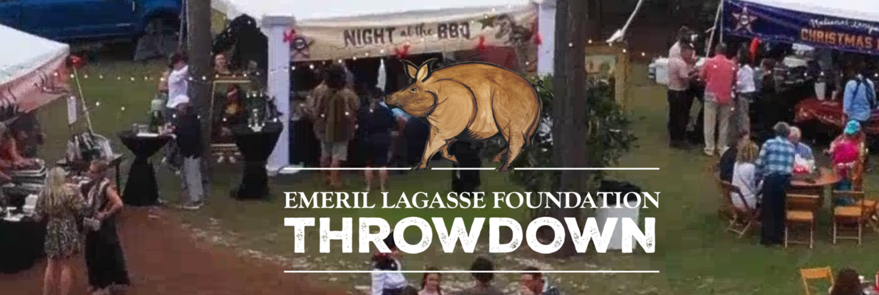
Keri created the event’s logos and evolving identity system, then developed a fresh annual theme and carried it across every audience touchpoint—from the first invitation through the live auction. The work combined high-energy storytelling with disciplined production, creating a cohesive experience for guests, sponsors, volunteers and beneficiaries.
Selected deliverables
Annual themes and event identities
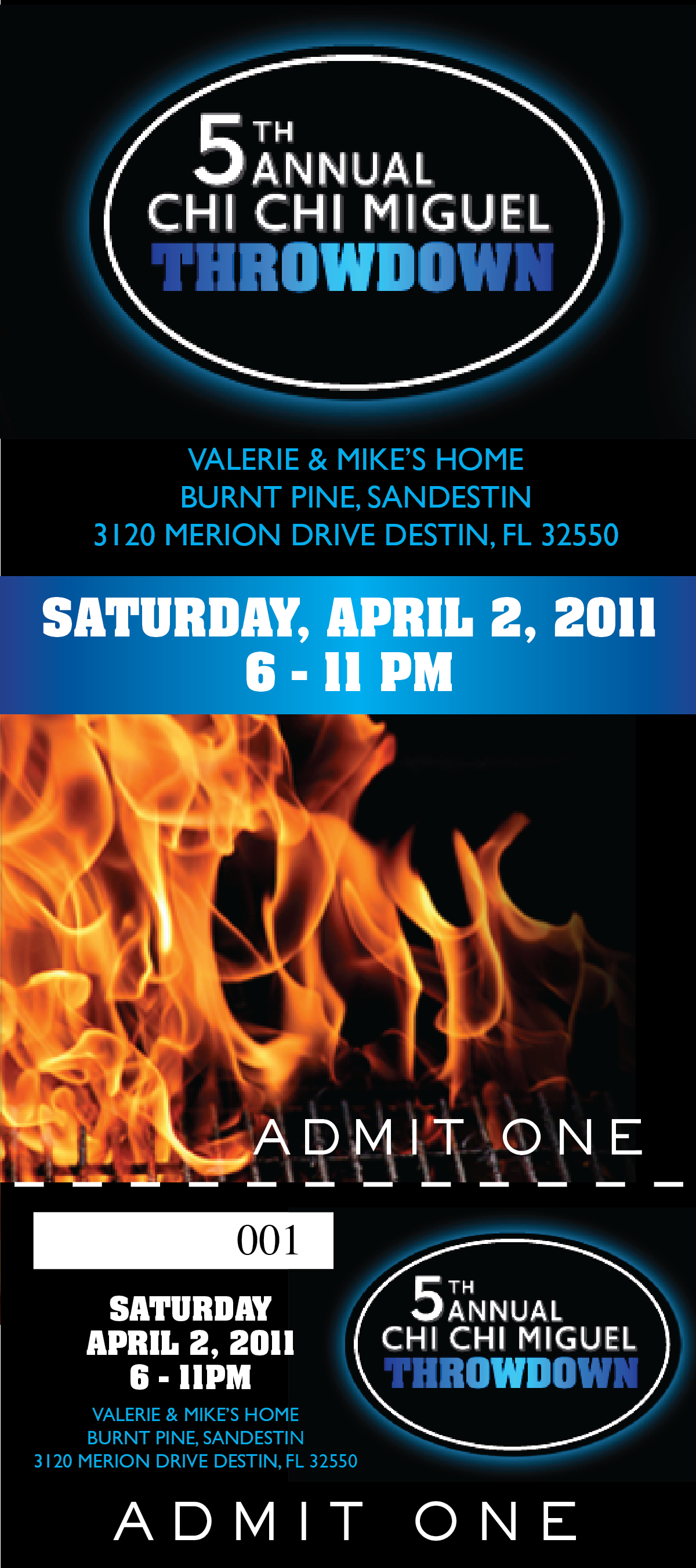
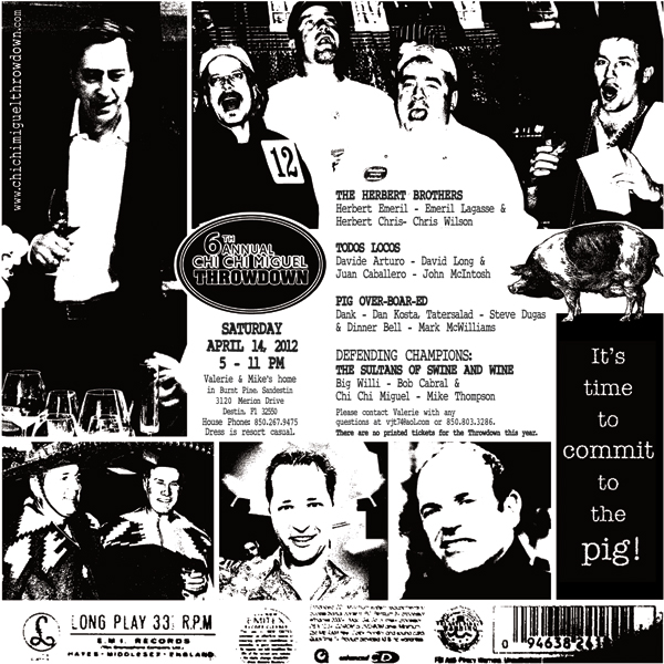
Invitations and patron materials
Auction catalogs and collateral
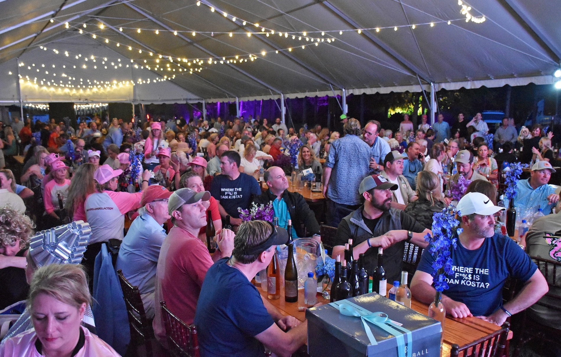
Live-auction presentations
Environmental graphics and signage
Merchandise and event support